My fascination with stadiums and arenas began pretty early in life. Of course, I was a sports fan, but I found myself drawn equally to the venues in which games were being played on TV as the games themselves, to the point where by the time I was in middle school algebra, I was full-on into stadium doodles.
Why middle school algebra? Well, because one of the required materials for that class was graph paper, and suddenly I had the ability to make scale drawings when I wasn’t using the paper for cylinders and parallelograms.
I had an active imagination, of course, but most of my drawings came from a place of knowledge. I was in middle school around the time Oriole Park at Camden Yards opened, ushering in a new era of ballpark design that fully enthralled me. I read a lot about ballpark architecture during that time, to the point that for a while, becoming an architect was my career goal.
This was also slightly pre-internet, so the best place for me to get stadium information was the Yellow Pages. I grew up in Southern California (and still live there), so the info section of my local Yellow Pages included seating diagrams of Dodger Stadium, Angel Stadium (then still known as Anaheim Stadium), and even Jack Murphy Stadium in San Diego (later Qualcomm Stadium).
I cut out these diagrams and pinned them to the wall in my bedroom, so I looked at them every night and drew a lot of inspiration from them — both in terms of my stadium doodles and my aspiration to eventually travel for sports.
To answer a follow-up question you might have: Yes, I was a weird kid.
And no, I never did become an architect. But recently, I came across my old drawings, which I somehow managed to save for a good 25 years. It was fun going back over them and wondering what the heck I was thinking in a few instances.
Below, I’ll present a few of the ballparks I drew and explain a little bit about my possible inspiration, and what I think of them now. Oh, and this is only the first part of a series — I’ll delve into the drawings I did for football stadiums and basketball and hockey arenas in future posts.
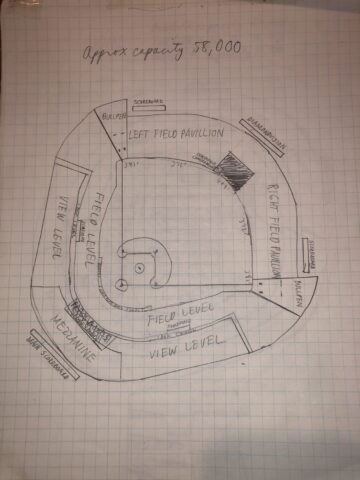
1) The Dodger Stadium-like doodle
If you know a little bit about the shape of Dodger Stadium, you’ll see it reflected in this doodle, down to the symmetrical field, the bullpens by the foul poles and the small Top Deck (here labeled “Mezzanine”) behind home plate.
I also like that I wrote that this stadium’s approximate capacity as 58,000, as Dodger Stadium’s capacity is famously fixed at 56,000. There was absolutely no math done here to arrive at that figure — I just eyeballed it and wrote down a number I felt was appropriate.
Looking at this doodle now, it doesn’t look like it’s big enough for 58,000, and I think any MLB team owner who was presented with that capacity number these days would faint — and then fire me on the spot when he came to.
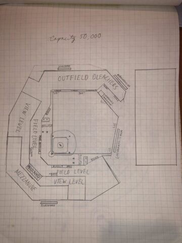
2) The Camden Yards carbon copy
Yup, that large rectangle behind right field is supposed to be just like the B&O Warehouse that stands behind Camden Yards, and a lot of the shape of the ballpark also reflects the jewel in Baltimore.
I guess I was also into shortening the size of the levels as they went up, as I also did this in the doodle above. Looking at this, 50,000 also seems large for this drawing, and there’s no way the field level would extend as far back as it seems to here — that would be like 50 rows deep!
3) The faux Fenway doodle
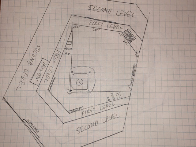
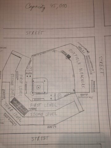
On some drawings, I would start by putting in a random street grid and then imagining what kind of building could fit in the space I was given. That’s what I did here, though judging by the width of the streets in comparison to the scale of the ballparks, those aren’t streets — they’re superhighways!
Otherwise, this is a pretty strong ripoff of Fenway Park, right down to the tall left-field wall, the rooftop seating, the bullpens beyond the right-field wall and the large right-field bleachers. I’m not happy with myself for not having the foresight to add novelty seats in left field and a red dot in right field where the longest home run hit there landed.
4) The artificial turf wonder
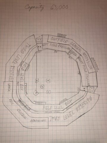
This isn’t based on any ballpark in particular, but it does look to me like an attempt to modernize the cookie-cutter ballparks that still were in heavy use in the 1990s. And look — it’s obviously an artificial turf field, complete with slide pits! Hope not too many imaginary ballplayers who played here tore up their knees.
Like with the doodles above, I really don’t think this place would seat 63,000, but it would be pretty large by today’s ballpark standards. And I don’t know how that “Outfield General Admission” level would fly — might be popular with fans, who undoubtedly would love the cheap seats, but who knows?
5) The true bandbox doodle
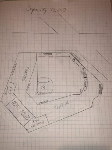
This doodle also looks like it draws inspiration from Fenway Park, though the dimensions and shapes aren’t quite as crazy. The bullpens are in foul territory here, something that I know has since gone out of style. Perhaps this is more like Wrigley Field than Fenway?
At any rate, the thing that caught my eye most about this drawing was that large chunk of space behind the left-field wall. This wasn’t thought of much back in the day, but I look at that now and envision a perfect place for a party plaza with games, picnic tables, concessions — the whole nine yards.
6) The mega stadium doodle
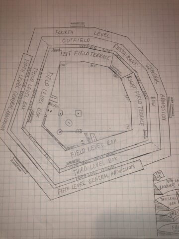
I’m going to go out on a limb here and guess that the inspiration for this doodle is Toronto’s SkyDome (now Rogers Centre), a stadium with which I was unusually fascinated. This ballpark has five tiers of seating, like Rogers Centre does, and instead of a hotel dominating the outfield structure, it’s a restaurant. That’s one mighty big restaurant.
Also, I don’t know who would sit in that Fourth-Level General Admission section in the outfield. You’d probably need a telescope to see home plate from that distance. If this stadium were actually built, I’d imagine that level would get cut from the final plans.

 Edward de la Fuente | Itinerant Fan