Not long ago I unearthed a folder full of stadium and arena doodles I had created in middle school, all done with materials from my algebra and geometry classes and drawn in the style of stadium diagrams you used to find in the Yellow Pages back in the day.
Looking back through them, I consider them to be prime evidence of my budding fascination with stadiums and arenas that fostered my love of sports travel — you could say they’re at least partly responsible for the creation of this site.
And I’ve enjoyed reviewing some and thinking, “Wow, this looks a lot like fill-in-the-blank stadium does today,” or in other cases, “What the heck was I smoking here?” I imagine the stadium architects who do this sort of stuff for a living have these thoughts go through their mind all the time.
Previously, I shared a set of ballpark designs from this collection of doodles — if you want to know the full origin story behind my drawings, I go deeper into it in that post.
For this edition, I’m sharing a few arenas that I drew up — some basketball-only, some hockey-only, a few that were designed to accommodate both, and a surprise or two.
Like with the ballpark post, I’ll go into my impressions of these diagrams upon seeing them some 25 years later, and try to delve into what I might have been thinking as I was creating. Let’s dive in!
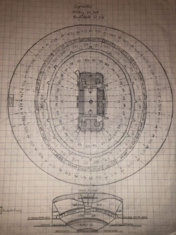
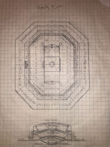
1) The round, large amphitheater
I grew up watching Lakers and, more frequently, Kings games at The Forum in Inglewood (known during my formative years as the Great Western Forum). The Forum was a round building and thus had a round seating bowl, though not nearly as large as the one depicted above.
But it’s pretty clear to me that the arena where I watched my first professional basketball and hockey games was the basis for a lot of my arena doodles.
The first thing that struck me about this diagram, and most of the other ones I did, was the amount of detail I devoted to it, right down to numbering the seating sections. Considering how much time I spent on it — presumably at the expense of homework I was supposed to be doing — it’s a wonder I made it out of middle school.
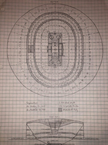
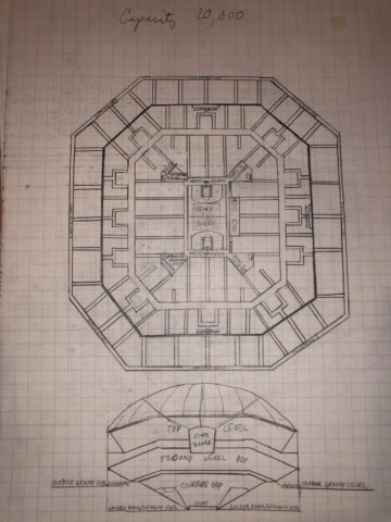
2) The round, large amphitheater, Part 2
The only real difference that I can see between this diagram and the one above is that the lower bowl is a more distinct oval shape — meaning, I used a ruler to draw these lines.
Even with the similarities, I included this one because I think it’s fun to compare and contrast what the viewing experience would be like.
I’d venture to guess that the sight lines would be slightly better in the first arena doodle because the chairs in the sections that aren’t lined up with center ice/midcourt would be angled a little more properly toward center. Yes, I do geek out over this sort of thing far more than you might expect.
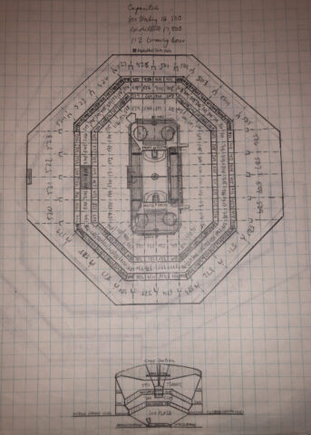
3) The Octagon doodle
If you’re an NBA fan of a certain age, you might remember that the Atlanta Hawks once played in an arena known as the Omni, the predecessor to what is now known as State Farm Arena.
The Omni had a square footprint but the basketball floor inside was positioned diagonally, making for a seating bowl with far more room for seats along the baselines than in the corners.
So that was clearly the inspiration for this arena diagram, and dare I say it — I think this is an interesting doodle and something that could actually work as a modern sports venue.
There is actually one comparable to this that I can think of among current NBA arenas: AT&T Center in San Antonio, which has an octagonal shape and lots of seating in the upper-deck sections along the baseline.
That building opened in 2002, long after I was done with middle school, so maybe I had more forethought in sports venue design than I thought.
4) The standard arena doodle
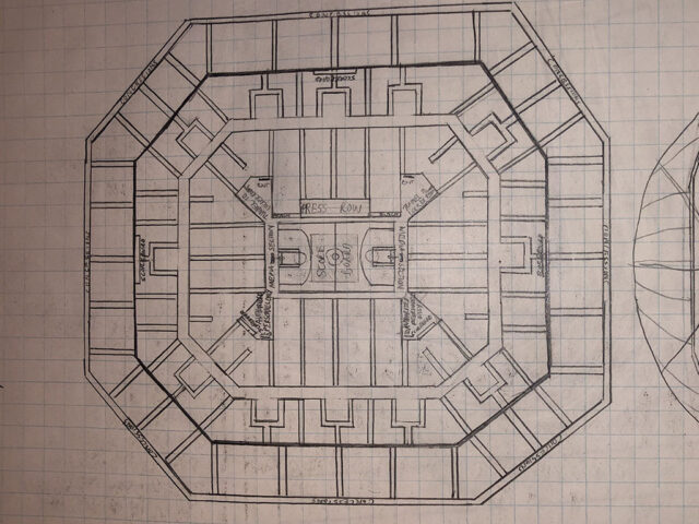
Other than the sharp lines and corners, there is really nothing adventurous about this arena doodle, which apparently was meant to be hockey-only.
And there’s nothing wrong with that per se. Especially in the 1990s, arena designs were not really very adventurous, and it’s clear that my doodles mostly followed that tack.
If this arena were built, I think it would be a perfectly serviceable place to watch a hockey game or any other event, and nothing else.
5) The smaller standard
This arena doodle looks fairly similar to the one above, but with a little less detail. Two things about it are interesting to me, though.
One, the cross-section includes this dome-like roof that suggests it’s a large facility. Two, the capacity I have listed for it at the top of the drawing is 20,000.
If you read my earlier ballpark doodle post, you know that I was consistently, um, generous with the capacities I put on these diagrams, and that they were based simply on the eyeball test as opposed to any mathematical estimates.
With all that said, I look at this drawing now and think that it would work very well as a college basketball gym. Scaled down to a capacity of somewhere between 8,000-10,000, I think it would provide a very good atmosphere, don’t you think?
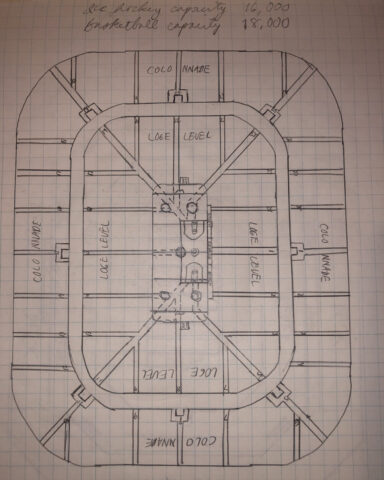
6) The rounded rectangle arena doodle
Last year I visited the renovated Nassau Coliseum for a New York Islanders game, and I couldn’t get over how small it was by modern arena standards.
Not just in terms of capacity (it seats less than 14,000 fans in its current configuration) but in footprint as well. If you placed the Coliseum next to just about any other NBA or NHL arena built after 2000, I’m pretty sure it would be dwarfed.
Well, that’s what I thought of when I came across this doodle. And in fact, if you compared Nassau Coliseum’s seating chart to this one, I think you’d see that they’re quite similar — right down to the shape and the aisle between the two seating levels.
So the capacities listed on this, 16,000 for hockey and 18,000 for basketball, are probably a little big but not by much.
One last observation: Why on earth did I place the basketball court off-center here? I’m not sure what kind of advantage it would have, but frankly it looks silly now.
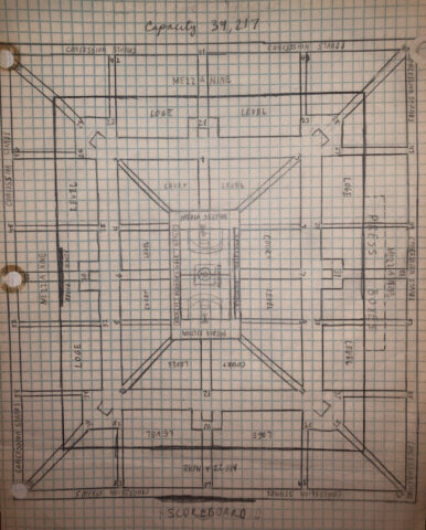
7) What the … ?
Perhaps of all the drawings I made, this one makes the least sense to me. Fine, the arena would be perfectly rectangular — but why would the seating bowl be perfectly rectangular, also? And would this building really seat 39,000-plus … for basketball?
I can only imagine what it would be like trying to watch a game from the uppermost corners of this place. Not only would the players look like ants, but your seat would probably be angled so you’re looking straight at the fan sitting across the aisle, and you’d have to turn your head 45 degrees the entire time play was in progress.
Oh well, you win some, you lose some. This arena doodle, probably more than any other, is a good illustration of why I never wound up doing this for a living.

 Edward de la Fuente | Itinerant Fan
