I was a serious doodler during my school years, and one of the things I loved to draw was stadiums and arenas. They were nearly always down in seating-chart form, and created using materials from my math classes — usually algebra and geometry.
I made dozens of drawings in that time, and eventually I moved on and stored all of the doodles deep in my closet. But recently I unearthed them, and have had fun sharing them on the blog as well as on Instagram over the last couple months.
My previous entries have been separated into posts about ballparks and arenas. This time around, I’m looking at multipurpose stadiums. I am a child of the ’80s, after all, and back then those types of venues were still very much en vogue.
The first NFL game I ever watched live was a Los Angeles Rams game in what was then known as Anaheim Stadium. It was terribly configured for football, but not too many people seemed to care back then.
As I got older and began traveling for sports in earnest, I got to see a few of the cookie-cutter stadiums around the country, such as Veterans Stadium, Three Rivers Stadium, Riverfront Stadium and so on — before all of those venues met their demise.
Multipurpose stadiums are no longer a thing, but that makes these doodles more interesting to examine. At least for me, it’s fun to see what my adolescent mind thought was acceptable in stadium design.
I’m pretty sure these drawings would all get laughed at by stadium architects today, but so be it! Let’s see what I conjured up back in the day.
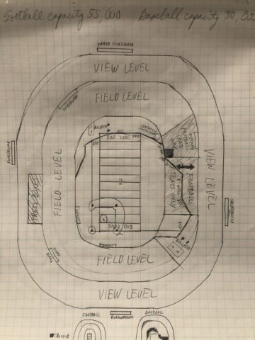
1) The football in a ballpark doodle
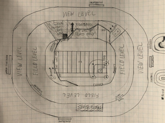
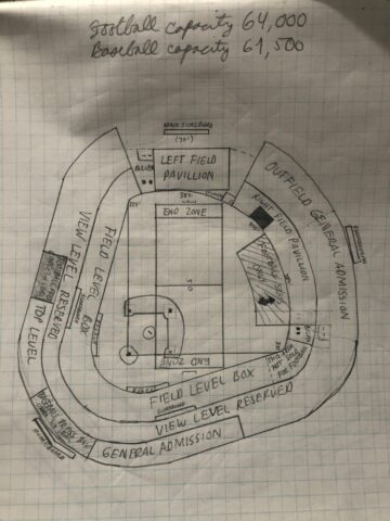
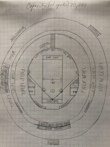
This first doodle is pretty much a ripoff of Anaheim Stadium’s old configuration. Or, more accurately, it’s a mismash of two of the stadiums closest to where I grew up: Anaheim Stadium and Dodger Stadium. You can see the short “general admission” top deck and the standalone left-field pavilion are directly lifted from the latter.
I think my favorite part of this drawing is the little section in right field marked “not sold for football.” If memory serves me right, this area at Anaheim Stadium was also not sold for Rams games, as it of course came with an obstructed view of the field thanks to the pull-out stands nearby.
But fans would still hang out there during games. Maybe they just wanted a respite from crowds?
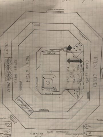
2) Baseball in a football stadium (part 1)
The Florida Marlins began playing baseball at Joe Robbie Stadium, a venue built for football, in 1993. To accommodate them, a section of the field-level stands along one sideline was reconfigured into pull-out seats in order to create a large enough playing surface for baseball.
I bring this up because I created the above doodle before the Marlins franchise started. And yet, this looks like a near-carbon copy of Joe Robbie’s baseball configuration, the only difference being the pull-out stands were in left field, not right.
So was I a prescient stadium designer as a 12-year-old? Probably not — more likely, multipurpose venues were common enough during that era and I was just riffing off already existing designs. The Marlins’ first home was just the place that immediately comes to mind when I look at this.
3) Baseball in a football stadium (Part 2)
This doesn’t resemble a real-life stadium to me but the concept is the same as No. 2 — wedge a baseball field into a football stadium while trying to retain a proper atmosphere for both sports.
I tried to get more creative in that the outfield wall for baseball is asymmetrical and has a few nooks and crannies built in, but in the end it just emphasizes how ill-fitting a venue of this shape would be for baseball.
If looking at this reinforces the ugliness of a multipurpose stadium to you, then I guess this doodle does its job just fine.
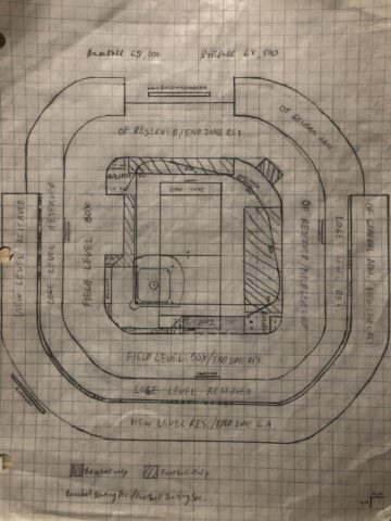
4) The wide-angle stadium doodle
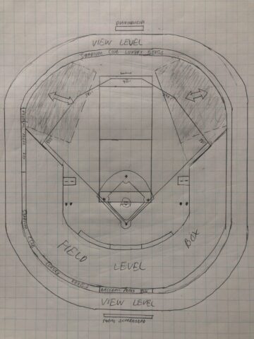
Here’s another example of a well-meaning design that just introduces more problems. Looking at this now, I have a hard time believing that the wider footprint enhances the viewing experience for either baseball or football — on the contrary, I think it would create worse angles for football fans.
Otherwise, I like the attempt at creating proper outfield distances for the baseball field. I believe these are taken from Dodger Stadium. So if you like watching ballgames on a symmetrical field but with 65,000 of your closest friends, maybe this design is the one for you.
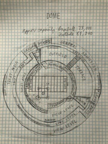
5) The circular multipurpose stadium
This looks to me like what the Oakland Coliseum might have looked like if, when the Raiders returned in the mid-1990s, they had honored the stadium’s round shape and not gone all Mount Davis on it.
In the end, though, this design seems like it would be serviceable for baseball but still terrible for football, with the prime seats on the 50-yard line too far from the field. I like how I put the “luxury boxes” in just two spots far away from home plate. And gotta love those sliding pits.
Also, I thought I owned a compass back in school, but looks like I forgot to put it to use here!
6) The oval multi
I can only go from old photos what the baseball configuration was like at the old Polo Grounds in New York, but I think it was a lot like the doodle above to some degree.
And look at those foul pole distances! Based on this configuration, the Shot Heard ‘Round the World would still have made it out, but Willie Mays would’ve run out of room before “The Catch.”
Otherwise, there’s not a whole lot about this design that’s remarkable. I do think it would’ve made a decent football stadium if some of the distances between stands and field were reduced, though.
7) The Franken-stadium!
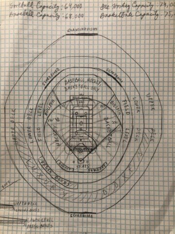
It amuses me that I tried to doodle a venue that could accommodate baseball, football AND hockey and basketball, but that was what they were trying to do with stadiums back then.
Remember that a handful of NBA teams played in domes regularly in the 1980s and ’90s, and for a time the Tampa Bay Lightning played in what is now Tropicana Field — and drew great crowds doing so.
I will say that I love the shape of this stadium drawing. Is there a real venue out there that looks like this? I’d love to know.
8) The stadium doodle that tries too hard
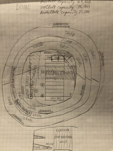
It’s hard to say what the starting point for this stadium design was. I think the idea was that it was a baseball stadium first that underwent an expansion, based on the way the seating bowl curves in the bottom left corner by home plate.
At any rate, you can see how domes were once set up for basketball events, back before the NCAA decided to open up the entire stadium and put the court on a stage. Dare I say this would’ve been a decent setup for basketball — at least, as far as basketball in a dome goes. As for the rest of it, I have to say this is one of my more off-the-wall doodles.
9) What the…?
Speaking of off-the-wall, just look at that football configuration! So much for prime 50-yard-line seats. This harkens back to a time when no one seemed to care about the overall experience of going to a sporting event, as long as you just got inside and had a view of the field.
That’s why I saved this particular doodle for last — I like that I had a vivid imagination for stadium design, but this one strikes me as absolutely wild. But that’s what makes looking at these nearly 30-year-old drawings so much fun.
Heck, maybe I’ll gather up the graph paper and ruler and try my hand at some new drawings, based on what I know now and what current design trends are. If I do, I’ll be sure to share them in a future post.

 Edward de la Fuente | Itinerant Fan